Gnome for the Holidays
I am really excited to be a guest designer for Whimsy Stamps again this month. I just love Whimsy Stamps and all their artists. What a creative group they have! This year especially.
Today is my first edition of this stamp set. The 2nd edition will publish on Friday with a completely different look. My goal is to inspire you to go from one end of designing to the far other end.
So, here we go!! As y'all are making your Halloween Cards and Fall Cards, I decided to switch it up and go for Christmas. And Crissy Armstong has not let us down with her fabulous gnomes celebrating the holidays.
No printed paper was used in either of these cards. OH, grab a cup of coffee, this is a long post...lol
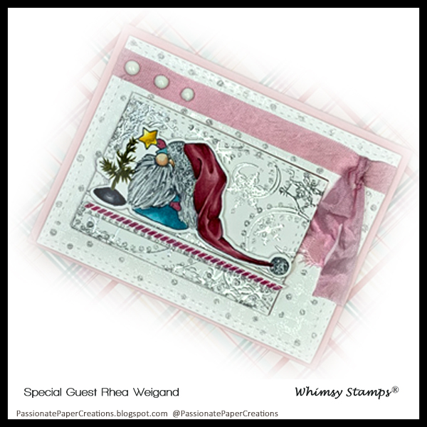
Do you like a little glam? I admit I do like my bling. I admit this card is much prettier in person. Let me explain that to ya. I used the 2 background stamps. In the first layer of this card, I used the Gingham Background stamp. I inked it lightly with Versa Mark and embossed it with a white detailed embossing powder. For the top layer, I used the beautiful Snow Flurry Background Stamp. I again inked it up with versa mark very heavy to get a serious impression and used a silver embossing powder.
Now wait, there is the ribbon, I had to add that it gave it a little chic. Hang on, I will get to the image in just a second.
There is a stamp set that is a staple! It's called Bendy Borders by Whimsy Stamps. I love this border stamps set! I have been using it a lot. As a teacher and many teachers I know, we talk about the importance of grounding your image. Please, ground your image! If you don't it looks like it is just floating there. This stamp set solves that problem. I did not like to fussy cut because the images didn't feel grounded. Now they do. As you see above I have grounded my image with a stamp line. That is stamped in a matching color of the hat and clear embossed. Gotta stick with the theme right!
Now for the adorable image, I colored him first. I wanted to be nontraditional. So I went pink and blue with a blue-green. The Pink was so simple R81 base coat the entire hat, Now for R85 to start detailing. Then I move to R83 to blend out the R85 into the R81 leaving plenty of R81 to be seen. I let it dry then look at it. Yup, it was weak. Ok watch out peeps, I'm going in deep! Bring in the R89! With the gentle flick of a surgeon's hands, I went into the deepest folds and laid down the lightest and smallest bit of color. Perfect. Then onto R85 and again with the gentle flick into the R89 to blend the dark into the previous colors, again just what I was looking for! R83 is up and forget the gentle hands but I'm careful not to oversaturate the paper I go back into the dark and blend it all forward to where the original R83 ended. R81 just went over the original R81 and barely into R83 to blend the edges. Haaaaaaaaa. Exactly the depth and contrast I was looking for. Yes, sometimes you have to repeat your sequence of colors to achieve your perfect look. Sometimes you have to bring in the scary dark color to make it pop! Don't be afraid of those scary really dark colors...they are your friends. Sorry, there aren't enough colors to do a Color Palette.
Ok, the long coat, this was an odd combination I just grabbed and did it. B00, BG53, B52. Ok, don't think about it. Just color. B52 I use all the time. But I only use it in my BG Family. Sitting here write to you all, I just thought of some combinations with it.
once the image was on I then used Tonic Nuvo Drops In White at the top and Silver Moondust on the card front to add the bling.
Thank you Whimsy For Having me this Month! I hope to be guesting again soon. 
Here are my affiliate links, by clicking on these links you are helping me support my craft habit.
Click pictures to open links.


No comments:
Post a Comment